Motion Identity
Qubit
Numbers don't have to be boring.
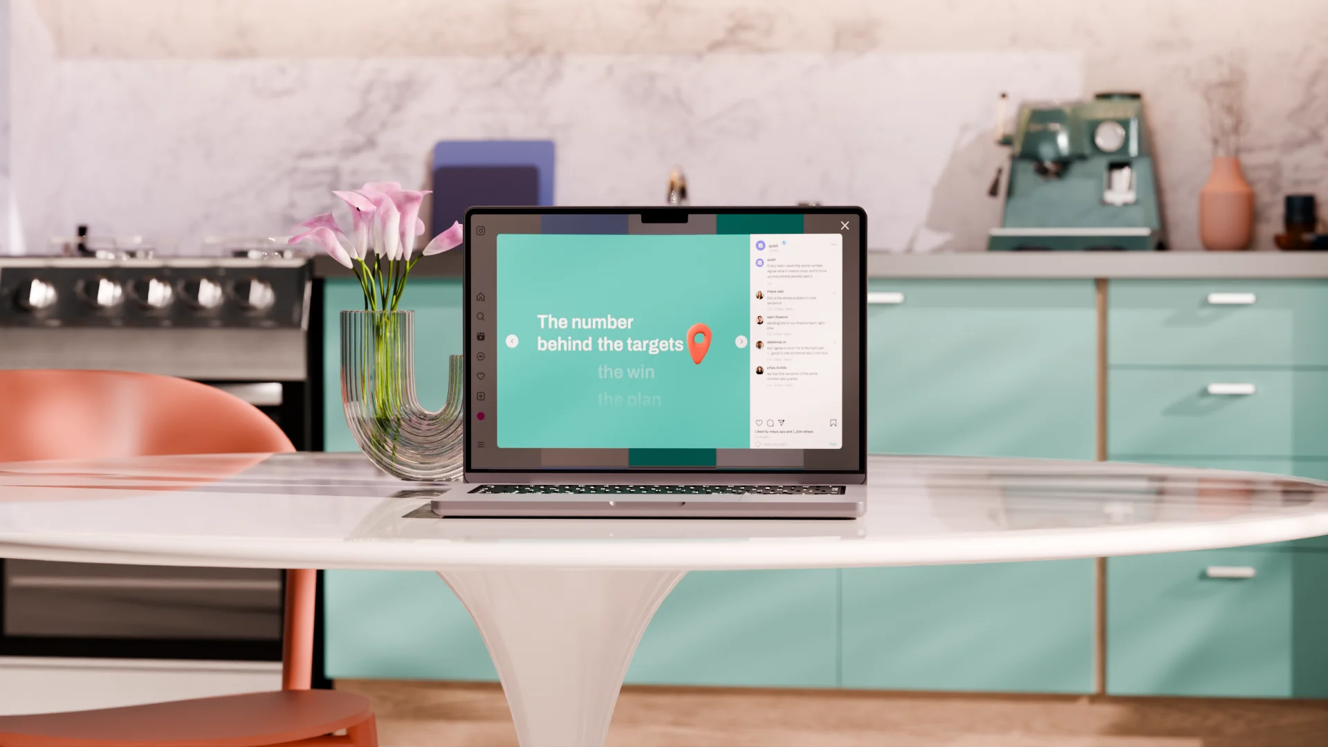
Qubit is where a company settles what its numbers actually mean. Everyone else in that category has decided this is a solemn occasion. We disagreed, loudly, in teal.
When your product is the place a company's numbers get defined you want to look like something people can trust, so everyone reaches for the same blues, the same grids and the same slightly stern tone of voice, and the whole category ends up looking like a bank.
The problem with that for Qubit is that the people who actually need it are finance leads, ops managers and whoever's putting the board deck together, people who've never used the phrase "semantic layer" in their lives and have no plans to start. Looking trustworthy doesn't get those people to open a tool. Looking approachable does.
So we went the other way and built an identity that's playful and a bit ridiculous, with one rule holding the whole thing together: the image plays, the data stays plain. Anything abstract, the idea of a number or a company agreeing on one, gets to be fun and tactile and a bit silly, while anything someone's going to make a decision from stays flat and clear and deliberately boring. It sounds simple but it does a lot of work, because it means the identity can be as playful as it likes without ever undermining the thing the product is actually there to do.
Qubit
Numbers don't have to be boring.
Qubit is where a company settles what its numbers actually mean. Everyone else in that category has decided this is a solemn occasion. We disagreed, loudly, in teal.

 Next up