Motion System
FRAKT
A generative brand system: a complete brand identity that designs, art-directs and renders its own content, all of it running in a single web page. FRAKT is a freight company we invented, so the approach could be proved on an identity with real weight and texture without a client NDA in the way.
The company is made up. Everything else here is real: the tool, the renders, the films. Every image on this page came out of the system exactly as you see it.
Guidelines describe a brand. This one runs it.
Every brand team knows the maths. The channels want content daily, the design team is four people, and the guidelines were last opened in March. The usual fix is templates, which drift, date, and slowly make everything look like the same template.
So the rules went into software instead: the materials, the compositions, the typography, the light. Not a template with blanks to fill in, but a system that generates finished, unrepeatable, always-on-brand work on demand. The deliverable is not a document about the brand. It is the brand, running.
An identity with real weight
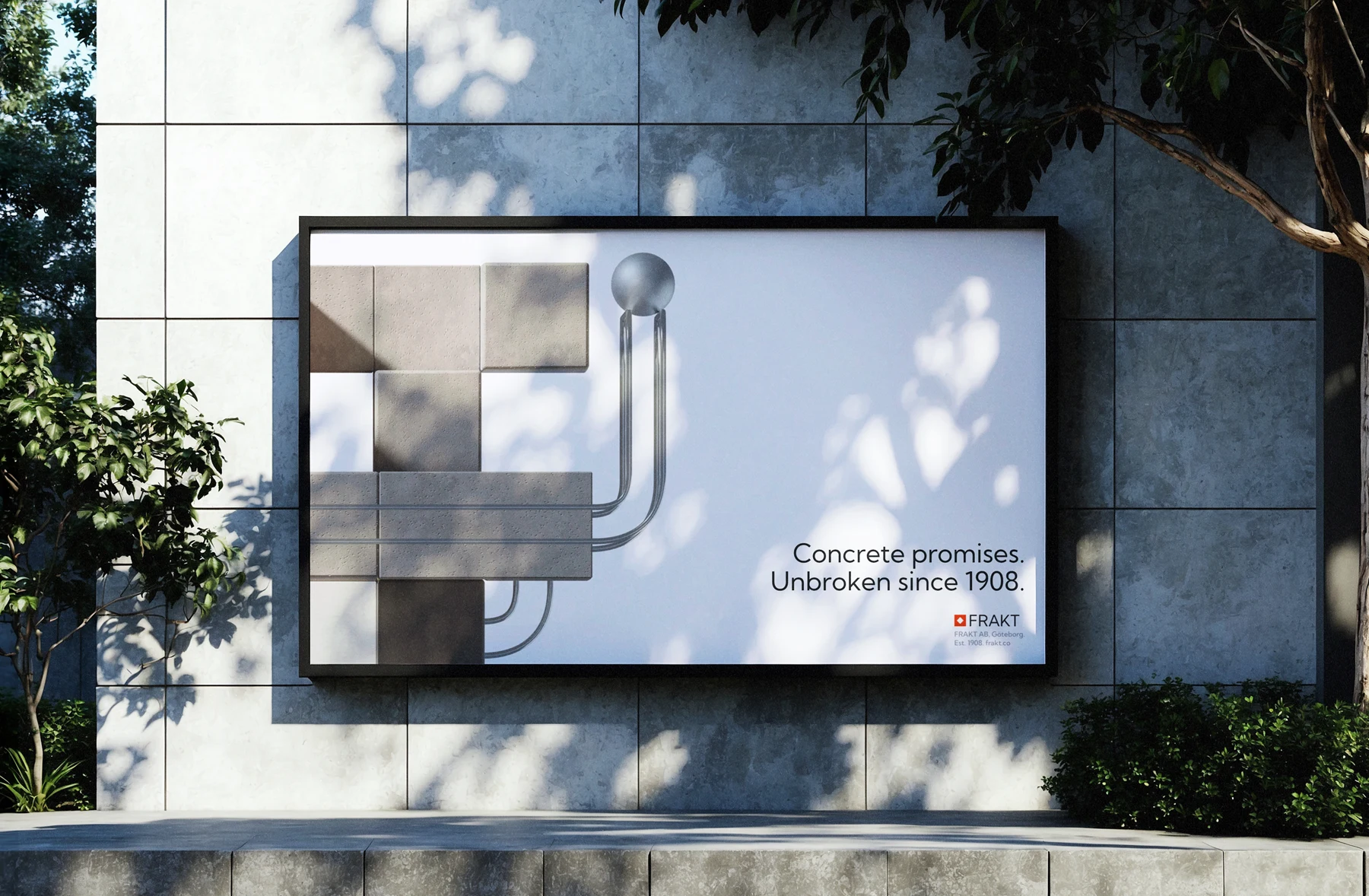
FRAKT AB is a Scandinavian freight company, and its identity is built the way its cargo is: sculptures stacked from concrete, timber, recycled resin, rubber and crate-red steel, threaded by twin chrome rails, with a glass marble rolling the route as the consignment in transit.
Every composition is cropped like a detail of something much larger, because that is what freight is. You never see the whole network, only the cargo in front of you.
Seed, direct, render
One click assembles a new sculpture from the kit of parts. Every seed produces a composition nobody has seen before, and the rules make sure every one of them is unmistakably FRAKT.
Then it is directed: sun, camera, crop, format. Drop in a headline and the typography sets itself, scale and clearances adapting to the format, down to the logo pinning itself to the correct corner. The art direction is in the system rather than in a checklist.
The same scene hands off to a physically accurate renderer for the finished article: a photoreal still in seconds, a looping film in minutes. For the hands-on there is a build mode, where anyone can place blocks like a kit while the system routes the rails, keeps the physics honest, and refuses to let a layout break the brand.
Every format, born native
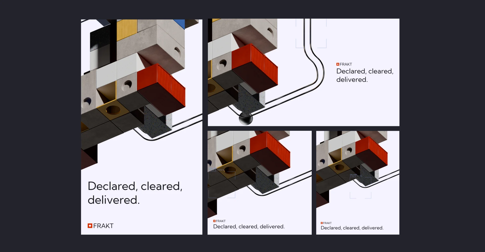
Posts, posters, stories, banners and films, each generated at its own size with its own type scale rather than cropped down from a master. The same composition becomes the post, the story and the film, so a campaign holds together everywhere it lands.
The proof is the campaign itself: a brand platform, a service ladder from bonded warehousing to fine-art transport, and the films between them. Every asset generated, typeset and rendered by the system, untouched.
What it changes
A month of social in an afternoon, because variations are free. Tests on the creative rather than only on the copy, because a new variant costs nothing. Consistency without policing, because the rules live in the code and nothing off-brand can come out of it.
No licences and no learning curve either. It runs in a browser tab, so the people who need the work every week stop queueing for the people who can make it.
Your brand, as an engine
A generative brand system looks different for every identity, which is rather the point. If your team is drowning in content demand, or the brand drifts the further it travels from the people who designed it, this is worth twenty minutes.
FRAKT
A generative brand system: a complete brand identity that designs, art-directs and renders its own content, all of it running in a single web page. FRAKT is a freight company we invented, so the approach could be proved on an identity with real weight and texture without a client NDA in the way.
The company is made up. Everything else here is real: the tool, the renders, the films. Every image on this page came out of the system exactly as you see it.
Two engines. The same second.
Left, the tool as you actually use it: the whole sculpture live in a browser, orbiting at full speed while you compose. Right, the same composition, the same camera, the same instant, handed to a path-tracer.
Look at what arrives with the render. Corrugation on the container. Studs on the rubber. Grain direction in the wood, aggregate in the concrete, and a real shadow where one block rests on another. Nothing was re-staged between the two: the framing on the right is the framing on the left, to within a thousandth of the composition's width.
Compose it, then light it.
Press compose and the tool assembles a new sculpture from the kit of parts. Every seed produces a composition nobody has seen before, and the four layouts are drawn rather than spelled: the shapes are the shapes, not a dropdown of their names. Under them sit the seed and the variation sheet, which is how one composition becomes a month of them without anyone opening a timeline.
Then it is lit. The sun is an angle you point at rather than two numbers to type, with three presets for the hours that flatter the material and the key and ambient underneath as sliders. A system that cannot be overridden is a system nobody trusts, so the manual controls are always one press away.
Colour, and the format it ships in.
The palette is the palette, shown as swatches in the order the brand ranks them. No hex, no names, nothing to look up: the only colours available are the ones the identity owns, so an off-brand choice is not a mistake to be caught in review, it is a thing that cannot be made.
Format works the same way. Square, portrait, landscape and story are each generated at their own size with their own type scale rather than cropped down from a master, and picking a shape places the typography with it: scale, position, clearances, down to the logo pinning itself to the correct corner. Then export.
A campaign, not a template.
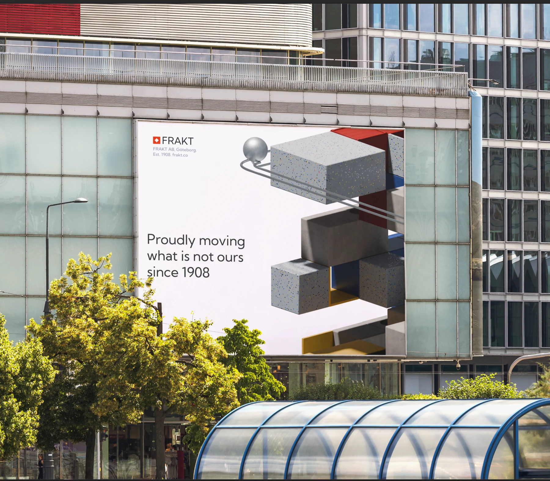
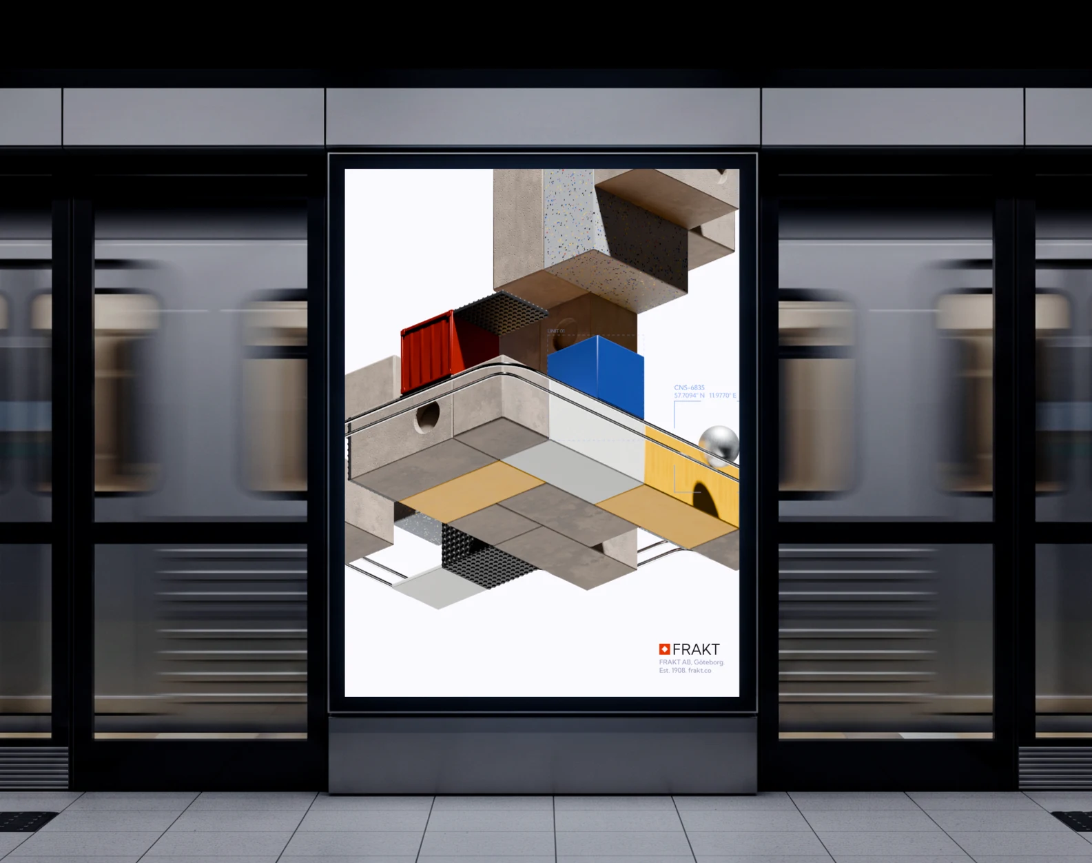
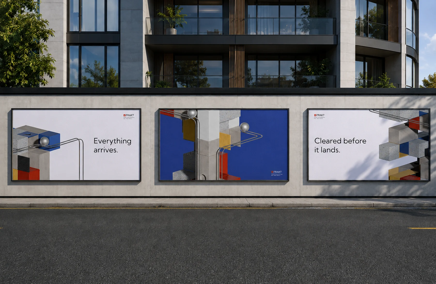
A brand platform, a service ladder from bonded warehousing to fine-art transport, and the films between them. Every asset below came out of the system exactly as you see it, and the identity was built to be cropped, so it survives contact with the real world at any size.
 Next up